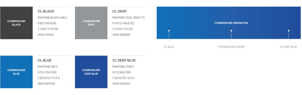
LOGO

The logo is the most essential element of COMMONLINK CI, serving as the primary symbol for all visual communications expressing COMMONLINK's image internally and externally. Careful attention is required to avoid any deformation of the logo's form or colors, and usage must strictly follow the guidelines in this design standards manual

CONCEPT

Symbol + Logotype format designed for consistent use across diverse media. The symbol metaphorically represents vibration, waveforms, and touch as COMMONLINK’s iconic point, crafted for versatile application across various platforms. The logotype employs bold lines and highly legible sans-serif fonts to convey a trustworthy, visionary corporate image

CI SIGNATURE

Signature is a design element featuring varied combinations of symbol and logotype, structured with variations for diverse applications. Select the appropriate signature per medium while strictly adhering to the prescribed principles for symbol-logotype combinations

Horizontal

Vertical

PRIMARY COLOR

Dedicated colors are systematically organized by medium and application for optimal logo color application, expression, and management. Consistent, precise use of specified colors is essential. For printing, strictly adhere to PANTONE and CMYK values to maintain the closest match to exemplified colors, following the color guidelines in this manual

PRIMARY COLOR

GRADIENT SLIDER

Scroll to Top